Today will be the first of a few posts I have planned talking about book covers. Specifically about how they change/relate to each other. I know this is almost over-done on a few blogs, but I really enjoy this type of thing, so you'll have to bear with me.
So onto today's discussion
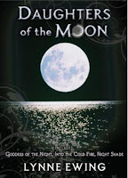
Thanks to The Story Siren's latest release post, I came across the fact that Hyperion is re-releasing the first three Daughters of the Moon by Lynne Ewing books in an omnibus. I really like it when my favorite books get reissued so that new readers can find them. And then I saw the cover of this new edition:

Excuse me? These books are full of action, mythology, magic, and pure evil, but does that cover look like it to you? I think if I saw that on the shelf I would just walk right by.
Now compare that with the original covers for those three books:


I love these covers. Granted, the covers for this series did get a lot better than these starting with Book 7, but I'll still take them over that bland black cover. So why (why!) did they go with that cover? Even what they did for the last book in the series (recycling the last 6 books covers into one giant college) would be better:
I don't know, maybe I'm just a color person. But although some might like the new cover for it's simplicity, I don't think it conveys to urban/fantasy feel that the old covers do. But maybe that's just me.
So, what do you think?
By the way, if you enjoyed this post, let me know. I have a lot of these in my head, but they won't get posted if no one wants to read them. I can just discuss to myself in that case. :)
And now, even though I have tons of other books to read, I think I want to go re-read these. They were some of my all-time favorites in high school, and I could use a comfort read right now...

5 comments:
I enjoyed this post! :)
I agree, the new cover is just so...bland. It looks like a nonfiction book on astronomy, not a cool YA book.
Definitely a cover fail.
OMG I saw the cover for the new edition and I didn't even realize it was the same book(s)!
I don't know if the book cover would grab me in a bookstore but the title sure would. Haven't heard of this series before. My 12.5 year old saw your post and wants to read the series. Would it be a good read for a 12.5 year old? jfs
Wow, I saw the omnibus just a few days ago and totally didn't realize what it was. It's so different from the originals! The old covers are admittedly a bit outdated, with the too-beautiful models and the color saturation. But the old one looks like a poor Paint job. I wouldn't pick it up--and I didn't.
Oh, and do write more of these posts. I have lots of these thoughts too. :)
These books were read by a ton of girls at my middle school! Anyway, I'm not a fan of the old covers, but the new one looks so boring! I can't see any teen picking it up.
Post a Comment